Case study 03
My Cosy Garden
A plant-care app built around the memories people attach to their plants.
In short
- The problem
- Plants die, often from overwatering and missing seasonal knowledge, and existing plant-reminder apps all share one format and feel disconnected from why people keep plants.
- The insight
- Plants are more than objects to their owners: gifts, memories of loved ones, companions. The brief shifted from a watering reminder to an app that also holds the emotional connection people have with their plants.
- The outcome
- A plant-care concept built on personality and memory rather than templates: users scribble a personality and note the memory behind a plant, after testers pushed back on pre-made templates.
10
plant owners interviewed, plus plant sellers
Research phase of this case study
Act I — Setup
Setup
Home plants beautify our homes and help us feel more connected to nature. But not everyone is an expert at tending plants.
I was having drinks with a couple of friends when one of my friends mentioned his plants had died. We all laughed, but then everyone started sharing how they’d killed a plant or two. And one of them even said he doesn’t want a plant because he is afraid to kill it.
Act II — Research
Research
I conducted some research and interviewed 10 plant owners, a mix of beginners (those who had just started keeping plants) and experts (those with more experience and owning more than three plants), as well as plant sellers, to gain insight into how their customers perceive plants.
During my interviews, I found a common theme among both beginner and experienced customers: recurring issues with plant care, particularly watering. Many people experience plant loss due to incorrect watering (overwatering), lack of seasonal care knowledge, or overreliance on generic advice, which led me to these pain points:
Beginner plant owners
- Difficulty understanding when and how much to water
- Lack of seasonal care advice (watering changes during seasons)
- No reliable reminder or monitoring system
- Identifying when the plant is sick or needs special attention.
- Misidentifying the plant needs or type.
- Scared to kill it.
Experienced plant lovers
- Difficulty watering the plant when on vacation.
- Poor watering by friends and family when on vacation.
- Users with very busy lifestyles are too occupied with the watering cycle.
- Struggles with how to hold them straight when it has grown tall and how to transplant them.
What I found
As I continue with my interviews, I found out that plants act as more than decorative objects to most plant owners, “Some plants are received as gifts from friend and hold special place in their heart”, “some are attached to it because it’s the only thing that reminds them of their loved ones that passed away and hold a special memories for them and they try very hard to keep them alive.” “Some take care of it as a companion, to see if they can care for something and nurture it to life.” “While some give their plants personality and Names based on how durable they are or how tender and attention needing they are.”
Common attributes of the plants for these users
- Emotional Attachment from a friend or loved one.
- Companionship and Nurturing.
- Remembrance of a person and memory.
- Categorising plants by personalities and giving names based on their Durability and tenderness.
Act III — Explorations
Explorations
From my interviews, I got the idea to make an app that both reminds people to water their plants and explores the emotional connections they have with them, which no other apps have offered.
I did a little research on other existing plant water reminder apps out there and found out that they all have the same format, and not just that, but also, using them feels disconnected.
Since most plant apps don’t offer a combination of plant watering service with an emotional connection, it gives me the freedom to explore various ideas and to work not in a confined space, but to set the rules.
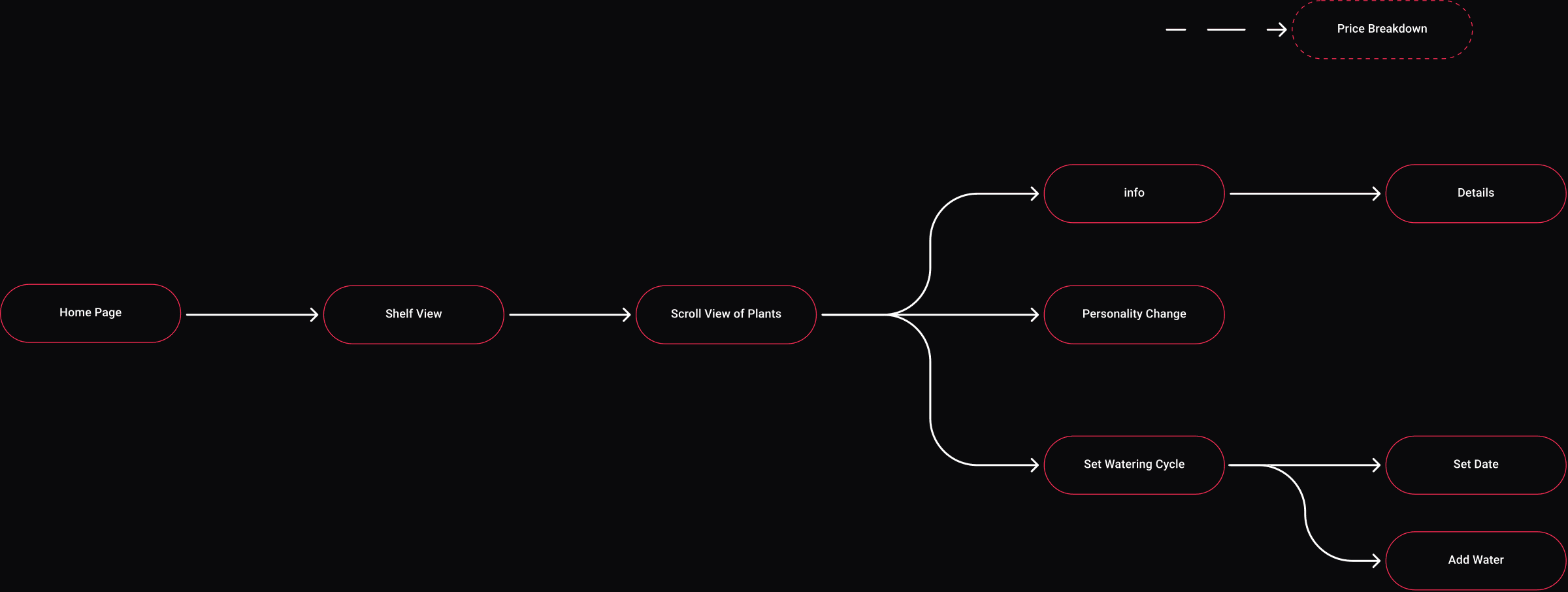
Site map
Here is my site map.
Wireframes
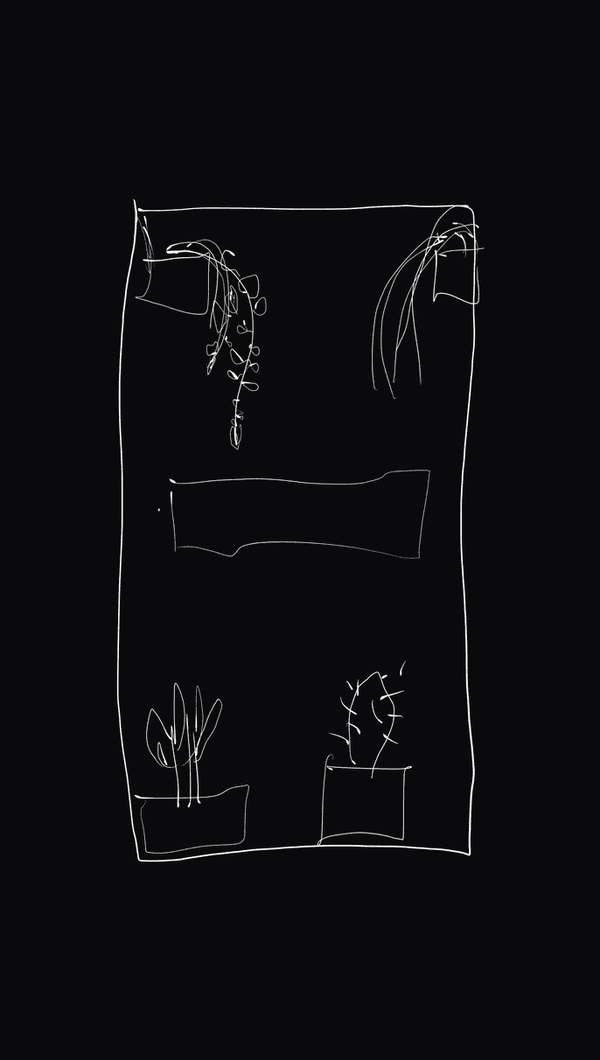
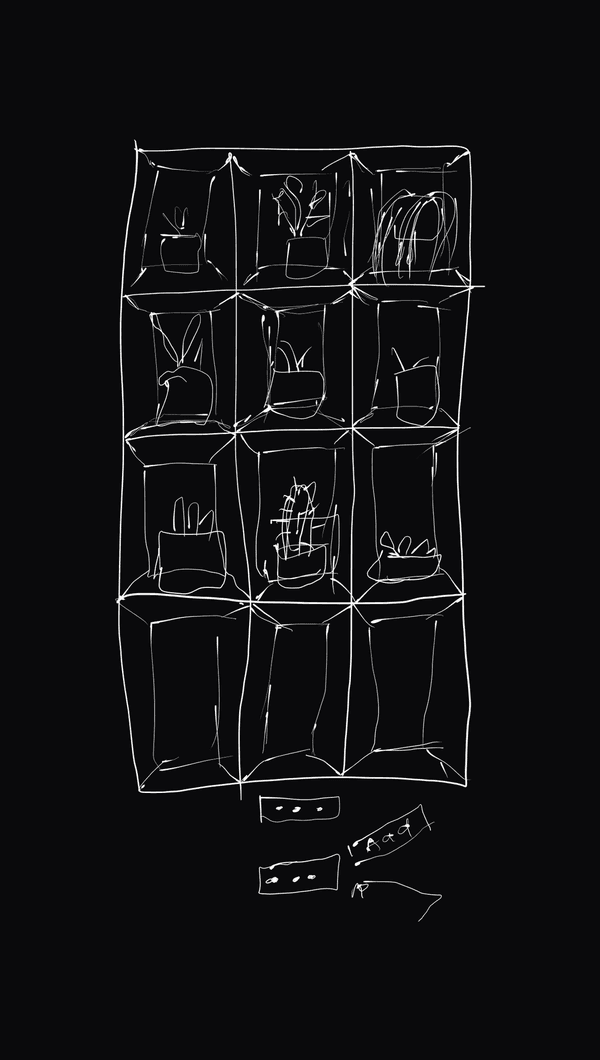
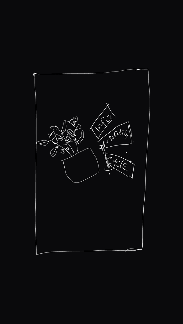
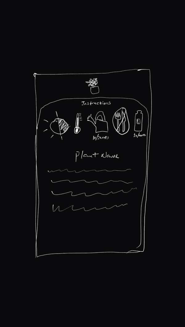
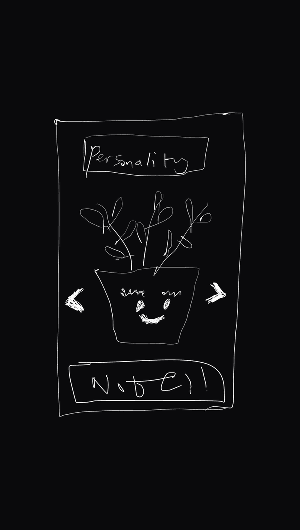
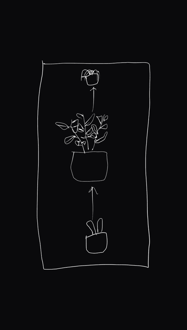
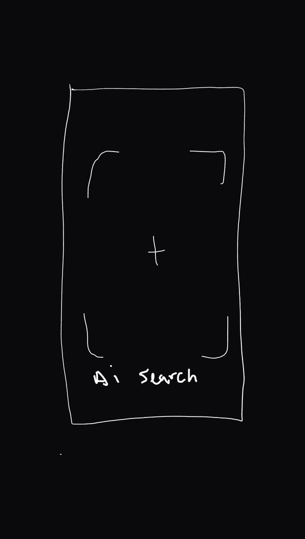
Here is the wireframe based on my research.
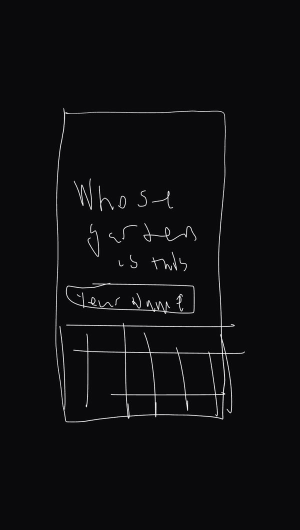
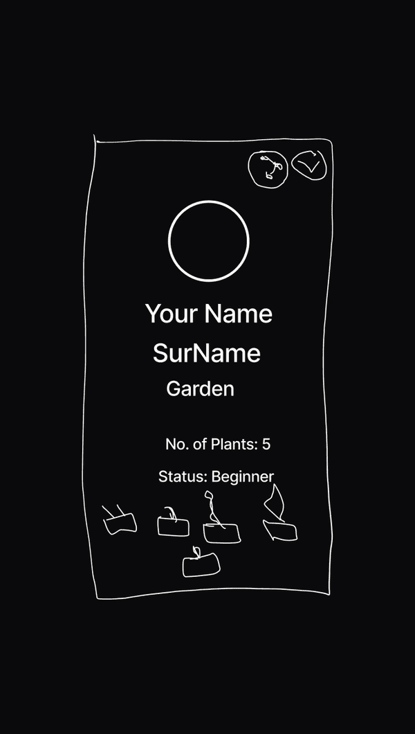
The designs
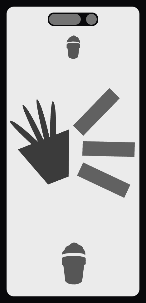
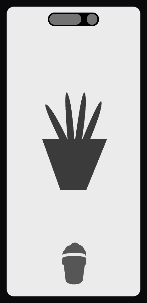
I aim to translate the interview results into design and then test whether it meets users’ needs.
Low-fidelity design, first pass
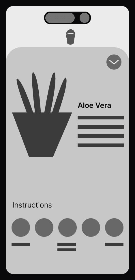
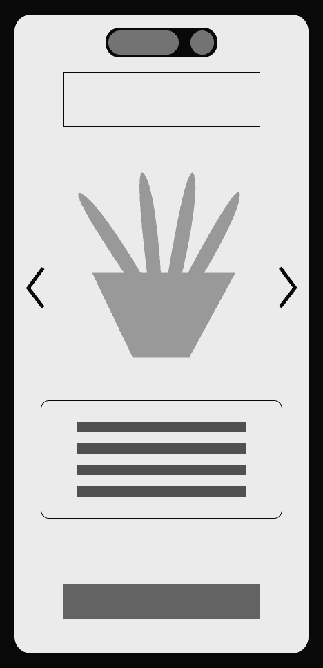
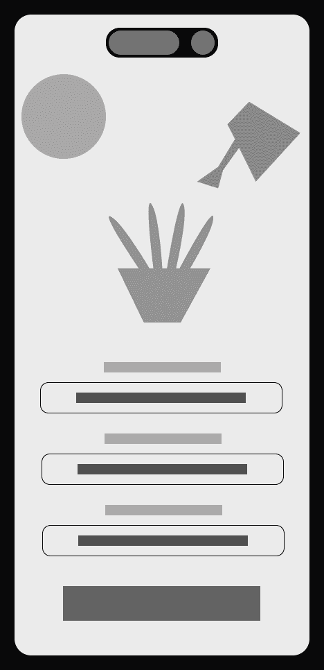
High-fidelity design, first pass
To accurately test user feedback, I built a high-fidelity prototype so they have a full understanding of how the interaction feels.
Act IV — Testing
Testing
I did the first test, and although I didn’t replicate the standard approach of placing the navigation bar at the bottom, they prefer this format much more and like the flow from one part to the next without a disconnect.
Personalise
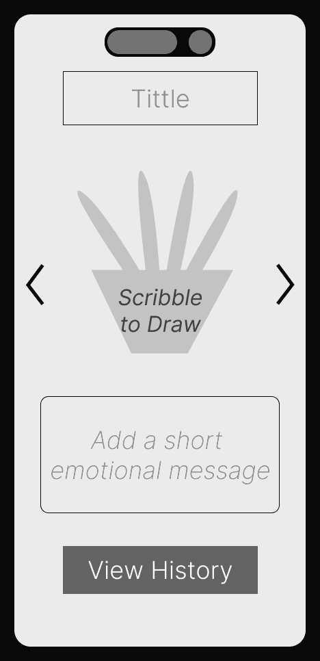
I noticed that not all users were satisfied with the pre-made template; some wanted the ability to customise it instead of choosing from a template.
I had to go back to the drawing board and adjust the personality part, giving the users the ability to draw (scribble) the type of personalities instead of having a list of templates and also to be able to write a short description about a memory or a situation they would like to remember the plant for.
Finally, instead of a pre-made emotion title, you can write the name of the person/people who bought the plant for you, or what prompted you to buy it; it can be a stage of life or a memory you would like to keep.
Cycle
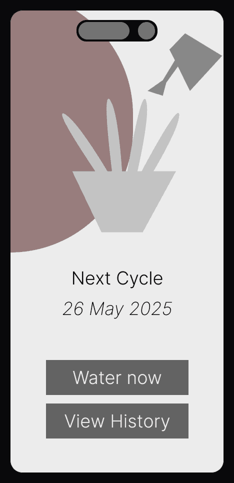
The cycle page seems too complex for users; it requires them to do too much work to figure out when the next watering cycle is.
I intend to solve this by letting the app automatically determine the watering cycle, so users don’t have to enter it; it will just show the next cycle. This is done using an AI-powered camera to identify the plant name, and the app syncs with the calendar and weather to determine when to increase or decrease watering.
Watering history
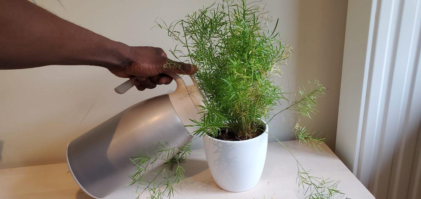
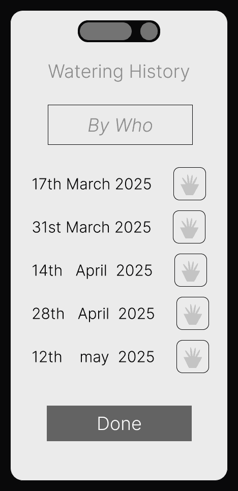
Since the App focuses on fostering an emotional connection through the plant, it is important to capture a time-lapse of the plant’s growth by taking a photo after each watering.
This function informs the app that the assignment is complete and helps diagnose the plant if it is unwell.
There is also a history of watering and the corresponding picture after each watering.
Cared for by
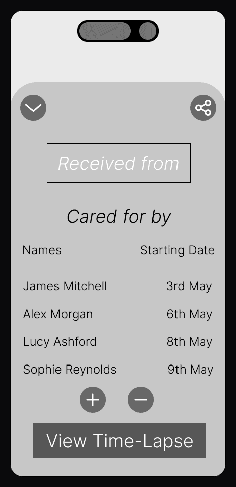
I also added a feature that lets you invite people to share the memory with you. Some collaborators will see the plant’s progress and growth. Each plant has its own collaborators, for example. One of the people I interviewed said she received her plant from her grandmother, who has passed away, and that taking care of the plant reminds her of her grandmother. Here, the user can share the plant’s growth and personality page with a family member related to her grandmother.
Users also mentioned they would like to share plant progress with the person or people connected to each plant, so I added the ability to share progress, which helps build a small community around each plant.
It is important to note that the people with whom each plant is shared vary by plant, depending on the emotional connections to the plants.
This also makes it easy to have someone water the plant while the owner is on vacation, so anyone can take over watering, or it can be rotated among them.
Also, it is a great way to diagnose the plant and receive help from other plant experts.
The revised low-fidelity screens
Test round 2
What I tested
How easy it is for the user to navigate, and how well they understand the flow.
What I heard
- All the users understood the flow and found it very easy to navigate, even those who are not particularly tech-savvy, saying it’s so easy to understand and navigate.
- A part still confuses users: how to provide feedback and diagnose the plant after watching a time-lapse of its growth, if they notice it is sick or simply want to comment on its growth.
Act V — The Turn
The Turn
I initially started with the idea of creating an app to remind users to water their plants, but as I spoke with them and learned what owning a plant meant to them, I realised that it is more than just a physical object; it has an emotional significance.
Act VI — Final
Final
The final design is shown in the film.
Logo design
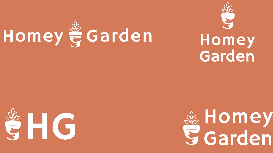
The logo has to reflect the brand, and I took my time to ensure it is memorable and that what it stands for is not misrepresented in the Logo design.
Brand colours
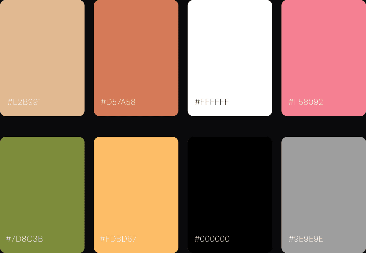
The brand colours are #E2B991, #D57A58, #FFFFFF, #F58092, #7D8C3B, #FDBD67, #000000 and #9E9E9E.
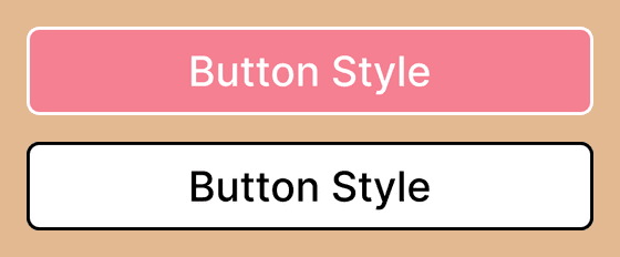
Button style
Act VII — Reflection
Reflection
Ultimately, nothing beats genuine, authentic communication with users.
Although research is valuable, our conclusions are often influenced by our biases. By engaging directly with end users, I learnt far more than I ever could from research behind a computer screen.
Thanks Special thanks to everyone who participated in the user research; your insights helped shape the design direction.