


Appreciation
We extend our sincere gratitude to everyone who participated in the user research. Your valuable input played a pivotal role in guiding the design process.
Disclaimer
This project was conducted purely for research purposes and is in no way intended to replace Google's official XR Browser. It was not affiliated with or developed in collaboration with Google’s software development team.
One beauty of browsing the internet is the ability to be in multiple places at once; in a web browser, this means opening multiple tabs simultaneously.
There is a standard format for opening tabs on a PC, and a different format for opening multiple tabs on a Mobile device. These design choices have been due to the different screen sizes.
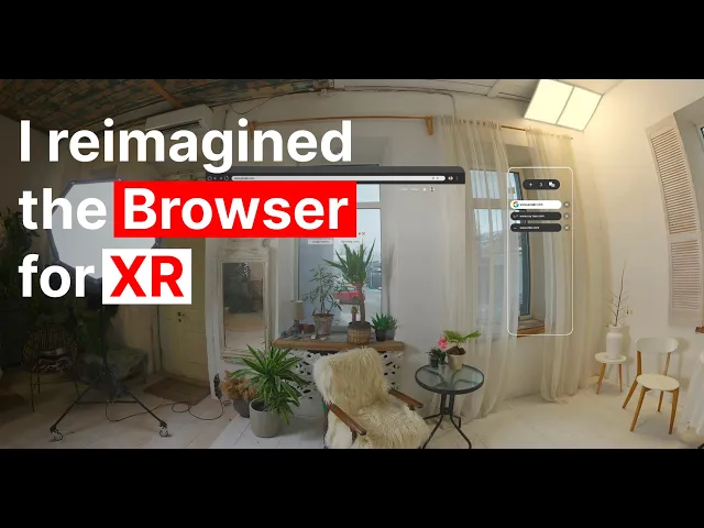
The new Google Extended Reality Software, commonly referred to as Google XR, features two modes: Home Space and Full Space.
In Home Space, apps run side by side with other apps, allowing for multitasking, while in Full Space, the app takes centre stage, offering a more immersive experience.

Image Credit: Android Development
The Home space web browser utilises a tab management system similar to that found on desktop browsers.
This poses a challenge, which is that a Monitor screen is limited to a rectangle, but an XR view can have at least an accessible 90-degree semi-focusable view (without head turn) and a full 360-degree view(with head turn).
Although the XR still uses a top panel to manage the Tabs in the Home space, it doesn’t look visually appealing to have multiple tabs open, and the large unused space around it is obvious.

Image Credit: Android XR

I aim to redesign how the Chrome web browser is handled in the Home space.
To better understand how other users perceive their tabbing experience in the web browser, I conducted Research with two groups.

The first group has a VR device (Oculus Quest) and has experience with navigation tabs in a VR device, on a desktop, and on a mobile device.
I found this group from my previous Master's Programs, the Luca School of Arts in Belgium.
The other group doesn’t own a VR device and are just regular users not into tech stuff, but are comfortable browsing in the Chrome browser on desktop and mobile
Both groups like to open multiple tabs, especially when researching or working, and don’t close them until their work is done, which can take weeks or even months.
Below is the breakdown of their feedback.
After the research, I was able to figure out the pain points of the users and the questions I am solving for:
How can I create a better tab management system for XR that helps users visualise all their open tabs?
How can I reduce the claustrophobia that arises due to multiple tabs open?
The main reason Google chose that format is to integrate it into their existing platform. To be clearer, they want you to open a Google Chrome on your laptop
or mobile and continue browsing the same tab on the Google XR glasses without a hitch. which is why they chose to stick with the desktop tabbing system. Designing a new
tabbing system has to keep the same functionality as the hybrid method to keep the sync.
This are Wireframe based on the research


Here are the Designs


I conducted another study with the same participants in two different groups. But this time around, I asked them individually to rank their
The top two (2) best choices, giving their pros and cons on why the design might work or not.
Out of the three low-fidelity prototypes.
Design 1
Pros

It shows a little part of the website thumbnails.
It shows the name (URL) of the website being visited.
Design 2
Pros
It displays the website thumbnails clearly.
You can easily know what each page contains.
Design 3
Pros
It can contain a lot of tabs arranged in a vertical order without them overlapping.
It shows the name(URL) of the websites visibly in each tab.
It is clean and simple.
Cons
You can only see five (5) tabs upfront, except you scroll downwards.
It will take a lot of space and can be visually hindering.
The thumbnails can be a visual overload.
Cons
The name (URL) of the website is not visible.
It will take a lot of space and can be visually hindering.
The thumbnails can be a visual overload.
Cons
Of the three, the third design is the most preferred based on its effectiveness ranking. So I took the third design choice and worked with it.
I built a high-fidelity prototype and then added other websites to see how it would hold up.

Google in XR

Showing Multiple Tabs
Nike in XR
Ray-Ban in XR
At this point, I was mostly done with the design and decided to go for one final test with my test groups.
What I was testing at this point is how well integrated the design is with their familiar tabbing system
After testing, the user was able to have as many tabs as possible while still keeping the names of the websites visible at all times and since the design consideration
Of Android is taken into account, the tab can still be shown and expanded into multiple tabs, but I still needed to add icons to identify the brand names.
Not everyone likes reading, but seeing the icon helps recognition.
Although they understood the design, this is the feedback I was able to gather from them
Not interactive enough.
It looks flat.
They don’t feel immersion.
This time, I thought of how best it is to present an Augmented Reality Application without using a VR headset. I researched several methods, since most people haven’t done this before, and I had to develop a way to make it possible using existing design software.
The discussions I had with users have made me realise that asking the right questions helps me understand their needs more quickly. Also, you have to look beyond what the user is saying to understand what they meant, because most people are bad at communicating.