


Tesla has a strong brand identity rooted in innovation, minimalism, and emotional resonance. However, its current website experience, although highly functional, is meant to replicate the physical showroom feel when shopping for a car online; therefore, it lacks the immersive appeal of its physical counterpart.

This UX case study explores the concept of redesigning Tesla's website into a fully immersive 3D showroom, inspired by insights gathered through user and sales agent interviews.
The current Tesla website is designed to be highly functional and remove as many distractions as possible to make the buying experience straightforward. To achieve this, the website presents the car information and purchase option to the user with minimal text and corresponding images.
Case Studies
I did a couple of interviews to figure out how efficient this method was. For this, I interviewed two sets of people.
Tesla owner who has experience as a user.
A salesperson in a Tesla showroom because they meet a lot of customers and understand what the customers are searching for in recreating the same emotional feel.
The overlap result from the two interviews expresses that buying is an emotional journey, and to make a purchase, they must have an emotional attachment to it.
The Tesla owner says he has been in Tesla cars before and loves the feel of them. After he had viewed the website, he made sure to visit the showroom to see what he wanted to buy.
The Tesla Sales repetitive at the store also confirmed that most people want to buy a Tesla because of the emotional appeal they got from it after chatting with them and showing them some of the car features in the showroom.
I don’t aim to reinvent the wheel here. Tesla has already found a way to make the website hight efficient. My task here is to bring the emotional appeal when viewing the website. I am going to be focusing on the following aspect
Homepage
Similar to the physical showroom, I aim to create a virtual showroom that has all the cars visible in 3D so the user can interact with them.
Order now Page
As a game Designer myself, I know just how cool it is to have a 3d customisation view.
On my visit to the Tesla showroom, I asked the sales repetitive if there is a feature missing in the Tesla website, what would it be? and he confidently said “ME”. He explained that the clients need a guide to explain the feature to them and tell them how owning a Tesla might change their lives. At the core of humans is the need for certainty. And the sales agents are present at the showroom to remove all doubt that might hinder sales.
Virtual Sales Rep
To recreate the same experience on the website, I will be adding a voice assistant virtual sales assistant again, an AI trained to understand all the core parts of the care, and more importantly, the AI will be trained to understand empathy and the buying psychology.
This is the the tesla sitemap but with a more immersive approach
I drew some sketches based on some pictures I took when I went to the physical showroom. I thought of how I could translate my research and the appeal into a design that would convey emotion. These sketches gave me an idea of what would work and what wouldn’t.
Out of the four sketches, the second and third ones are the most for the Home screen but I couldn’t figure out which one would work best.
So I proceeded to make a low fidelity protype in 3D with software like Blender and Spline to Test which one would work best in term of interactivity and emotional appeal without taking the user's focus away from the content.
For the I made the Second concept a full 360-degree turntable so the user could turn the camera a full 360 degrees around the cars
While for the Third Concept, I made the camera view still have a little user control for the camera view.
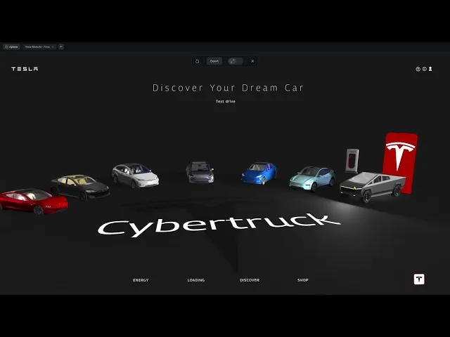
Arrangement based on the Tesla models, Clockwise from the first model, which is the Tesla Roadster, to the last, which is the Cybertruck. The only exception here is the New Model Y, which makes more sense to place beside the previous model.
Homepage
I made two different iterations of the home page design to test the emotional appeal.
I removed the Vehicle tab on the Tesla website and put the vehicles on display so the user can see them as the first thing when they land on the homepage.
For the Plate Number, I made the name of the cars in the style of a plate number and placed it in front of each car.
While for the Tab of the UI (Energy | Loading | Discover | Shop), I moved it below.
Order page
I made two different iterations of the home page design to test the emotional appeal.
I made the vehicle animated to show the feeling of it being on the road.
In the current Tesla website, the images and changes to the content have been selected; to replace this, I added a mouse scroll interactivity to show the features of the cars by rotating the camera to the part being selected on the menu bar.
Finally, I hid the price and additional information and made them appear only when highlighted.
After this, I went back to my two different Testers. The Tesla Agent and the Tesla owner, and here is the feedback I got from them.
Homepage
The first feedback I got was the text, The Tesla sales agent says most of their buyers are people advanced in age and use glasses, so making the letters on the home page more bold and legible would be great.
The two testers both chose the Homepage version 1 over the homepage version 2. The reason is that the popping to indicate the highlighted item seems not too stylish, but the first version, where only the headlamp and the glow show depict a sleek design, and they both like navigating the cars in this version.
The placement of cars and camera angle seems to be what they both spoke about, perhaps it’s not hitting that emotional appeal for them
Order now Page
For this, I got is to always show the price upfront.
I also got that the 3d Outline button on the “Order page version 2” looks too gimmicky and should have a more flat feel, so they went for version 1
The Order now” button on the first version is preferred to always be visible to reduce the friction of purchase.
But overall, the Order now page seems to be well-received.
The result of the feedback was that it’s all about the emotional appeal, and something about the arrangement of the cars doesn’t quite click for the test group. I guess that the car size being tiny on the screen does not look enticing enough; it should be on display big enough so the buyer can be enticed by it. So I will have to redo the homepage
But overall, the Order now page seems to be well received, just some minor tweaks, and I am good to go.
After doing some extra fours designs, I went in search of general car owners, not specifically Tesla owners, but a mix of people who use all kinds of cars.
I aim to test which design works best for people who are in different phases of life in terms of
Age
Education
Taste
Sex
It turns to my surprise, these designs don’t have the same effect as my initial design.
I hypothesised that people tend to gravitate towards what they know, which is why I made the garage and horizontal parking designs, which seem to have the opposite effect, as people didn’t want what they were already familiar with.
The Merry-GO round design doesn’t display all the cars, while the Museum Design seems to be scattered across the floor.
Although the initial design is most preferred, it is because I reduced the angle of the view.
It is important to note that during the first user interview, the people were trying to adjust the view of the camera since the camara has a slight degree of freedom to it.
I asked them why and most of them says the view is note so comfortable with them. I did a little research on found out that prople are
What stood out
There was one thing that stood out amongst these, which is the Font size. They loved the Huge typeface and how they could easily identify the name of the cars without having to squint their eyes too much or depend on the limited knowledge of which car is which.
After getting the feedback about the font size in my initial design, I asked myself, How can I make the car names appear while also filling the space of the blank background?
So I made a bunch of designs varying the position and the placement of the text.
Text Style 1
Text Style 2
Text Style 3
Text Style 4
Text Style 5
Text Style 6
Text Style 7
I tested these new Text designs on the last test group. Although they seem to have different preferences. I made them choose a top three, and choose the design that is most common among their choices, and that is design style 7.
From this UX and Ui design, I learned that the phrase “People don’t know what they want” is partially true. The issue is in the communication; people don’t generally know how to communicate what they want, but “when they see it, they know they want it”.